34 is up.
...and here's some classic Fall (something for those who can't be arsed going to the comic site) It was either them or Shakin' Stevens...
Monday, February 28, 2011
Sunday, February 20, 2011
UXB 33 and some process stuff...
Well what do you know, I got the latest page up just in time...
I'm not going to set a specific day or time for the delivery of each page, I'll be happy just as long as I get it finished and uploaded "sometime" within the week!
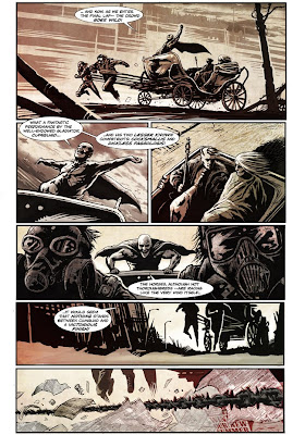
I thought I would share some of the stages of getting this thing done.
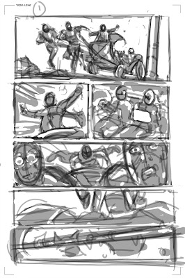
OK, first is my really rough layout/thumbnail. I usually keep pretty close to the original thumbnail- however a few changes were made on this one. I changed the angle of the carriage in panel 1 and pushed the guys back a little in panel 5 for better readability when the chain comes up into frame in panel 6. I also decided at the last minute to give the "horses" gas-masks ...
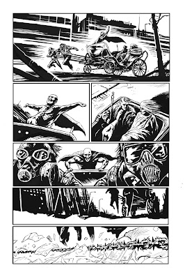
I then create an ink layer- lower the opacity of the thumbnail and away I go. It's all pretty organic at this point- resizing when I need to, erasing and redrawing until I'm reasonably happy with the inks. The backgrounds are inked on a separate layer.
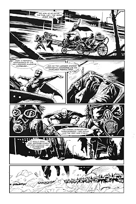
Then the speech bubbles are added. The lettering was done by none other than Sean Philips! Yeah, he had some spare time...
...
No not really. I simply used his font, bought and downloaded from the Comic Book Fonts website.
Then it's time to get into the colours. I decided to keep them quite muted and as a final touch faded the backgrounds out a little to give the art a little more depth (another good reason to keep the BG on a separate layer)
And that's it! I'm a terrible fiddler though (no, not a fiddler on a roof or the other type -- you know what I mean!) so I'm sure I'll hate it tomorrow- but for now, at least at this precise moment; I'm quite happy with how it turned out...
Now just to stick it up on the UXBCOMIC website.
Tuesday, February 15, 2011
Cars
...in the french disco pub style:
I think Bill Bailey has just surpassed Numan's classic; and all it took was some bike horns and a dodgy french accent...
Monday, February 14, 2011
Wednesday, February 9, 2011
UXB 2 and other stuff
Starting into the second run of UXB. The first page was posted last week and the second has just went up.
Will try my best to stay on track.
Other news: I was quite recently brought on board as illustrator for the comic EARP: SAINTS FOR SINNERS ( Radical Publishing.) I penciled only a few pages for issue 1, however with issue 2, I took over as the main artist. I had always wondered what having your work 'inked' by someone else would be like, well... here, I am having my work literally 'painted' over by the artist Kyushik Shin. It should be available early March.
I'll see if I can post some images further down the line.
The covers are by the excellent Alex Maleev.
Subscribe to:
Posts (Atom)